Chapter 6 - String Operations
%matplotlib inline

import pandas as pd
import matplotlib.pyplot as plt
import numpy as np

pd.set_option('display.mpl_style', 'default')
plt.rcParams['figure.figsize'] = (15, 3)
plt.rcParams['font.family'] = 'sans-serif'
We saw earlier that pandas is really good at dealing with dates. It is also amazing with strings! We’re going to go back to our weather data from Chapter 5, here.
weather_2012 = pd.read_csv('weather_2012.csv', parse_dates=True, index_col='Date/Time')
weather_2012[:5]
Output:
6.1 String operations
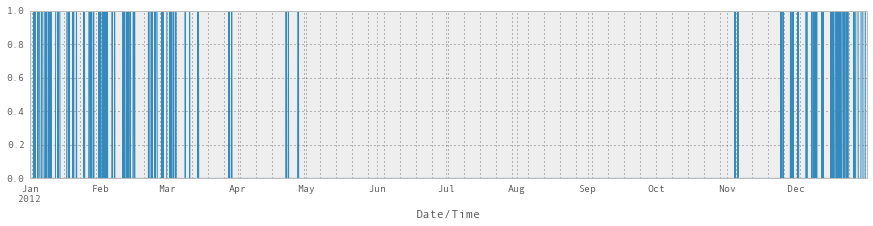
You’ll see that the ‘Weather’ column has a text description of the weather that was going on each hour. We’ll assume it’s snowing if the text description contains “Snow”.
pandas provides vectorized string functions, to make it easy to operate on columns containing text. There are some great examples in the documentation.
weather_description = weather_2012['Weather']
is_snowing = weather_description.str.contains('Snow')
This gives us a binary vector, which is a bit hard to look at, so we’ll plot it.
# Not super useful
is_snowing[:5]
Output:
Date/Time
2012-01-01 00:00:00    False
2012-01-01 01:00:00    False
2012-01-01 02:00:00    False
2012-01-01 03:00:00    False
2012-01-01 04:00:00    False
Name: Weather, dtype: bool
# More useful!
is_snowing.plot()Output:
6.2 Use resampling to find the snowiest month
If we wanted the median temperature each month, we could use the resample() method like this:
weather_2012['Temp (C)'].resample('M').apply(np.median).plot(kind='bar')Output:
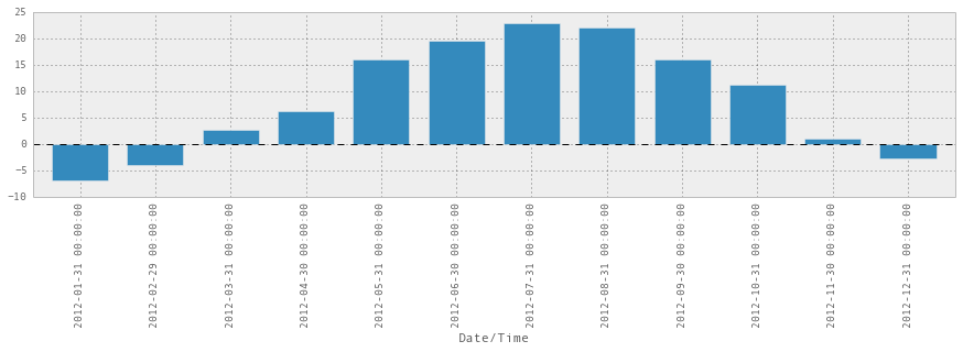
Unsurprisingly, July and August are the warmest.
So we can think of snowiness as being a bunch of 1s and 0s instead of Trues and Falses:
is_snowing.astype(float)[:10]Output:
Date/Time
2012-01-01 00:00:00    0
2012-01-01 01:00:00    0
2012-01-01 02:00:00    0
2012-01-01 03:00:00    0
2012-01-01 04:00:00    0
2012-01-01 05:00:00    0
2012-01-01 06:00:00    0
2012-01-01 07:00:00    0
2012-01-01 08:00:00    0
2012-01-01 09:00:00    0
Name: Weather, dtype: float64
and then use resample to find the percentage of time it was snowing each month
is_snowing.astype(float).resample('M').apply(np.mean)Output:
Date/Time
2012-01-31    0.240591
2012-02-29    0.162356
2012-03-31    0.087366
2012-04-30    0.015278
2012-05-31    0.000000
2012-06-30    0.000000
2012-07-31    0.000000
2012-08-31    0.000000
2012-09-30    0.000000
2012-10-31    0.000000
2012-11-30    0.038889
2012-12-31    0.251344
Freq: M, Name: Weather, dtype: float64is_snowing.astype(float).resample('M').apply(np.mean).plot(kind='bar')Output:
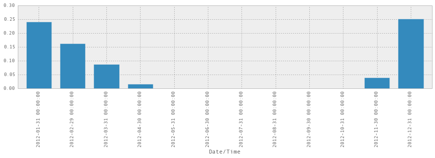
So now we know! In 2012, December was the snowiest month. Also, this graph suggests something that I feel – it starts snowing pretty abruptly in November, and then tapers off slowly and takes a long time to stop, with the last snow usually being in April or May.
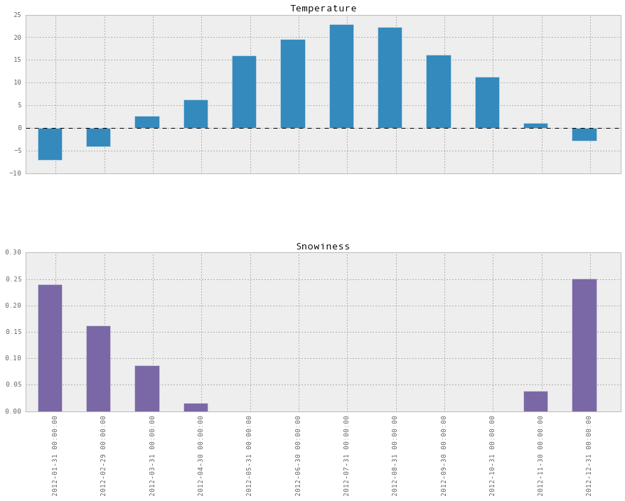
6.3 Plotting temperature and snowiness stats together
We can also combine these two statistics (temperature, and snowiness) into one dataframe and plot them together:
temperature = weather_2012['Temp (C)'].resample('M').apply(np.median)
is_snowing = weather_2012['Weather'].str.contains('Snow')
snowiness = is_snowing.astype(float).resample('M').apply(np.mean)

# Name the columns
temperature.name = "Temperature"
snowiness.name = "Snowiness"
We’ll use concat again to combine the two statistics into a single dataframe.
stats = pd.concat([temperature, snowiness], axis=1)
stats
Output:
stats.plot(kind='bar')Output:
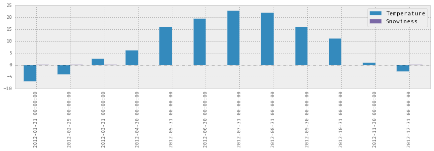
Uh, that didn’t work so well because the scale was wrong. We can do better by plotting them on two separate graphs:
stats.plot(kind='bar', subplots=True, figsize=(15, 10))Output:
Help us improve this content by editing this page on GitHub